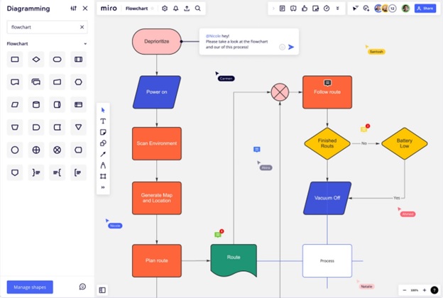
There are many ways in which we can use diagrams to make information easier to process. One of these diagrams is a flowchart. It usually depicts a system, process or algorithm. A flowchart is extremely useful, especially because it provides both the solution to the problem and the crucial steps needed to solve it.
While it might seem easy to create, a flowchart has its quirks. It’s simple but has a set of rules you should follow when drawing it. And if these rules aren’t followed, you risk your flowchart becoming illegible or hard to understand by your peers. In this article, we’ll take a look at some of the common mistakes people make when they create a flowchart. Let’s check them out!
Table of Contents
Mistake #1: The Flow Is Hard to Follow

A messy flow is usually the result of having placed the flowchart shapes too close to each other or drawing connecting lines that are hard to see. Before you use a flowchart creator, try to make a list of all the steps required in the process. This will give you a general idea of how much space you’ll need for your flowchart and you can dedicate that space to the steps.
When it comes to connectors, try to keep the lines strong enough so that everyone can see them from a fair distance. Don’t use very long lines that end up weaving around the shapes. This will make the diagram difficult to follow and understand. You risk forcing your readers to backtrack and lose focus. Usually, the return lines are the ones that should be kept a bit longer.
Mistake #2: You Didn’t Define the Forks

Forks are inevitable, especially when it comes to bigger projects. When that happens, make sure the decision paths are easy to make out and differentiate. Let’s say, for example, that you have the question “Which platform do I want my app to run on?” The next question, naturally, should ask whether you want it on mobile or desktop.
Also, avoid going straight to the final options, as your readers might get confused. You should always aim to introduce an additional step or idea between each final point. This will help you bring some balance to the layout and your audience will have an easier time understanding the information you’re presenting.
Mistake #3: Unintuitive Labels

The simplicity or complexity of the flowchart will not matter if the language used isn’t straightforward and concise. Try your best to avoid awkward sentences or drawn-out phrases. Also, stay away from overly-technical jargon unless you’re completely sure everyone in the room will understand what you’re talking about.
Before you add text to your flowchart, read the labels out loud to make sure you cut out any useless words or flowery language. Keep your phrasing short, simple and to the point. Of course, you can always have your colleagues take a look at your flowchart to make sure everyone understands it.
Mistake #4: Harsh Graphics

While you can go ahead and be creative in a flowchart, we don’t really recommend it. You see, creative flow charts are not usually good at conveying information. And that’s just what you want it to do. When it comes to design issues, these are the most common:
- Bad color contrast. Keep in mind that color schemes and background should never interfere with the content of the flowchart. If the colors used are harsh on the eyes and your readers have to struggle to read, the flowchart has lost its purpose. Try to use neutral shades or whites. Make sure the shapes themselves are clearly separated from the background and the text stands out.
- Too many images. While using images could be a good idea to illustrate concepts, ideas and moods you can’t really put into words, we don’t recommend using them too often. When you absolutely have to, use them sparingly and in areas that have plenty of white space so the connectors and shapes are visible. Also, don’t use images as the steps themselves. You risk having people misinterpret the information.
Why Should You Use Flowcharts
When it comes to tech companies, a flowchart will make it easier for a programmer or architect to explain the process behind the algorithm or app. Moreover, a flowchart can also act as a basis for the program blueprint. You’d be surprised how many programmers use flowcharts during the debugging process.

Another great thing about a flowchart is that thanks to its visual flow, it makes it easier for you to spot any inconsistencies or potential issues in the process. And if you need crystal clear documentation, a flowchart can play that part as well. Bottom line is – they can help everyone in your team be more efficient, since the data can be easily tracked and followed.
Our Final Thoughts
As you can see, creating a flowchart isn’t as easy as it might seem. There are some common mistakes people make, which makes it harder for their audience to understand the message. But if you avoid them, we’re sure you’ll become a master flowcharter in no time. Really, all you need is a keen eye for detail and a basic understanding of the industry you’re working in.
What about you? Have you used flowcharts in your work so far? What are some common mistakes you noticed you were making and how did you manage to overcome them? Share your thoughts in the comments below! We’d love to hear your opinion.

