Web design and digital marketing are always changing. mostly Every year new trends emerge around you. And we must know how to adapt to them and always keep in mind that the internet is a constantly changing world. And we cannot be left behind. There are some of the web design trends below
Table of Contents
These are web design trends for 2020
Minimalism: Less is More
Surely you’ve heard that less is more, and rightly so since sometimes we try to cover on the same page many of the actions that the user must perform, losing the final focus.
Clean and straightforward pages are not only more attractive to the eye but tend to convert better since it is easier to capture the user’s attention when we are dealing with a more linear design or patern than one full of elements.
This trend continues year after year.
A web page full of colors or elements that saturate is no longer useful; we must be clear and focus.
Design First For Mobile
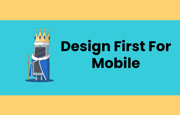
The custom of every designer is to start with the desktop version, but with the new Google algorithms, this has to change, and we must focus on the “mobile-first”.
Even if you’re using a cheapest website builder, your website should look good and pure on all devices, but you have to try to optimize it very well for mobile.
It is no longer useful that it is merely “responsive,” we must try to get the page visitor to reach the target on mobile by doing as little scrolling as possible.web design trends
The User is the King (UX)
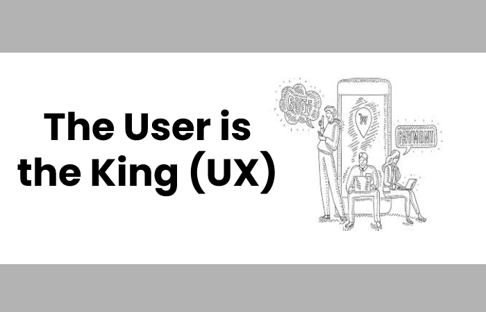
I’m sure you have read “content is king,” “video is king,” even “Google is king.” But no, the user is king.
We have must to design with users in mind. If we have good content for user, we will have good content also facing Google.
Positive user experience is essential and will determine how confident you are with the website you are mostly visiting.
But how can I know is this satisfaction is positive? Very simple, measuring.
We must analyze how users are behaving through our sites, and for this, we have a lot of techniques such as heat maps, session recordings, analytics from the website itself, etc.
Loading Speed: Your Website must go Like a Rocket

Fast loading speed is always a famous trend and never goes out of style since it is a differentiating factor within a website.
What Good is an Awesome Web Design if it takes 6 Seconds to Load?
We must carry out proper maintenance and monitoring of the web, whether WordPress, Prestashop, Magento, or what we have since all the tools are obsolete, and we must keep them up to date in the best possible way.
also, if we have a website where we install new plugins or functionalities, the ideal is that every time we make a change of this model, we analyze the website with tools and see if everything is in order.
A fast website will improve the user experience, but Google will be able to track content faster and prioritize it over other websites where you have spent more time crawling.
Simple and Eye-catching Typefaces
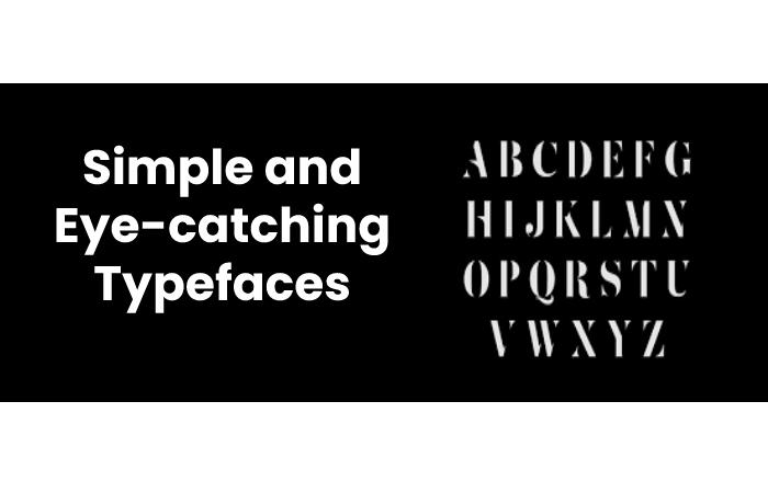
The simple fonts are always trending in design as they are easily readable for everyone.
Sometimes we put calligraphic fonts that can be very aesthetic and give a touch to the web, but as I have said a few points above, the user is king, and we have to make browsing easy.
We must reward usability and easy reading before design and aesthetics since they can be very attractive to us, but not to others.
The design studios and marketing agencies know this, and InboundCycle simple and very visual letters are use.
Say Yes to the Menus of a Lifetime.

There was a time when the famous “hamburger menu” became fashionable, and many websites continue to bet on it. But what are we achieving with this type of menu?
We are making users go one step further in their process towards our ultimate goal.
And this can cause us to lose many of them along the way. You have to try to simplify it and provide everything you need at all times as quickly as possible (and without having to click too many times).
2020 Trend Colors
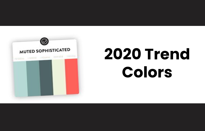
Although no color goes out of style, there are always some that stand out year after year, and if there is someone or something that can bring us closer to this, it is Pantone.
According to Pantone, the trend color for the year 2020 is “Classic Blue”, code 19-4052 TCX.
Animations, but not in excess
Animations are very visual effects that make a website very striking.
These serve to focus the user’s attention on a specific element.
But many go too far and end up filling their design with animations, being counterproductive due to both visual overload and resources. Use them, but without going over.
Chatbots are Here to Stay.

If we have an e-commerce, a services page, or we sell a course (among other examples), a chatbot can be decisive in the buying process of a potential client.
The objective is to resolve the doubts of this person and to end up finishing the purchase process.
In addition, these chats increase the confidence of those behind them because they know that they will have an advisor if they get lost.
Multimedia Content: More Video, 3D and Hero Images

Texts bore many types of users, so we must adapt to our target audience and show them the content that most calls them visually.
The videos are a sure hit, as well as to learn more about the brand, increase user retention on the website, and benefit the SEO positioning face.
The 3D and motion are fashionable, and we do not see many websites with this type of visual content and draw much attention.
Storytelling: Tell your Story
The big brands use it in their advertising campaigns, and it works very well.
The storytelling is to tell stories and is widely use in marketing to exciting technical users.
Is it Important to Follow Web Design Trends?
Design is a matter of taste, but it is useful to know the trends taking place in each sector to try to use them and give a feeling of “modernity” on our websites.
As I have already told you, everything must be measured and analyzed to improve our web design and orient it more to conversion, since there are probably sections in which we lose our users without knowing it.
It is important to follow trends, but it is also important to use them wisely and test them before implementing them with our audience.

